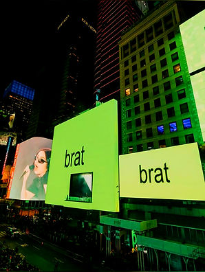
BRAT by Charli XCX:
Charli XCX has always been a trailblazer in both music and style, and her BRAT cover perfectly embodies her bold, rebellious spirit. More than just a promotional image, this cover stands out as a key moment in contemporary pop culture and graphic design — a visual that captures the essence of Charli’s fearless persona and pushes the boundaries of how music and identity are presented.
A Bold, Unapologetic Visual
The BRAT cover is a direct, edgy, and intimate portrait of Charli XCX that defies conventional pop imagery. It’s raw and unfiltered, the aesthetic is minimal yet charged with personality — the kind of visual that invites you in but keeps you guessing.
The simplicity of the composition puts all the focus on Charli herself, highlighting her as both the artist and the statement. This no-frills approach communicates strength and defiance, perfectly echoing the albums themes of self-assertion and youthful rebellion.
Graphic Design Elements That Matter
From a graphic design perspective, the BRAT cover shows how less can truly be more:
-
Minimalist Layout: The sparse use of text and graphics lets the photo do the talking, creating an intimate connection with the viewer.
-
Bold Typography: When text is used, it’s direct and impactful — often featuring sharp, sans serif fonts that match Charli’s edgy aesthetic.
-
Color Palette: The muted tones combined with sharp contrasts focus attention on Charli’s expression and styling, emphasizing raw emotion over decoration.
-
DIY and Authenticity: The design embraces a handmade, authentic feel rather than polished perfection, mirroring the albums unfiltered sound and attitude.
Cultural Impact
The BRAT cover is more than just an image; it’s a symbol of a generation embracing individuality and rejecting traditional pop princess norms. Charli’s presentation as a “brat” flips the script — she owns the label with pride, turning what could be a negative into a powerful statement of identity and confidence.
In a pop culture landscape often dominated by over-produced visuals, BRAT stands out for its honesty and rawness. It aligns with a broader cultural shift toward embracing imperfection, self-expression, and gender fluidity.
Why It Resonates in Design and Pop Culture
Charli XCX’s BRAT cover is a masterclass in how graphic design can amplify an artist’s message without overshadowing it. It shows that restraint, authenticity, and strong personal identity can make a powerful visual impact — sometimes more so than elaborate effects or hyper-stylised photography.
For designers, it’s a reminder that great design serves the story and the person behind it. For fans and culture watchers, it’s a beacon of empowerment, capturing the rebellious spirit of today’s youth culture in a single frame.
In Conclusion
The BRAT cover by Charli XCX is a bold, authentic, and culturally significant piece of design. It challenges norms, celebrates individuality, and demonstrates the power of minimalism in making a lasting impression. In both graphic design and pop culture, BRAT is a visual anthem for those who dare to own who they are — bratty, bold, and beautifully unapologetic.
A Visual Statement in Pop Culture and Graphic Design