
04
CASE STUDIES
At HelDesign, we craft brand identities that balance strategy, creativity, and timeless design. Each project is shaped by deep collaboration with our clients, resulting in visual systems that not only look beautiful but also drive meaningful impact.
Below, you’ll find a selection of our case studies—stories of brands transformed through thoughtful design and distinctive storytelling.

Casa Da Laranjeira : Branding a Luxury Villa Experience in Vilamoura
The Client
Casa Da Laranjeira is a collection of luxury villas nestled among orange tree farms in Vilamoura, Portugal. Each villa offers guests a refined retreat that blends contemporary elegance with the warmth of Algarve tradition. With such a unique proposition, the brand needed to capture both the exclusivity of luxury living and the rooted charm of its natural setting.
The Challenge
Casa Da Laranjeira approached HelDesign with a vision:
-
Establish a brand identity that conveys sophistication while staying true to its agricultural heritage.
-
Create a visual language that stands out in the luxury travel market yet feels timeless.
-
Balance modern elegance with a sense of place.
Our Approach
At HelDesign, we began by immersing ourselves in the textures, colors, and stories of Vilamoura’s orange groves. The name itself—Casa Da Laranjeira (“House of the Orange Tree”)—inspired a branding direction that would harmonize heritage with high-end appeal.

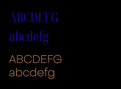
Typography
We chose a refined serif font to communicate timeless luxury, sophistication, and trust. Its sculptural letterforms echo the balance between tradition and modern refinement, ensuring the brand feels grounded yet aspirational.
Color Palette
-
Midnight Blue: A deep, elegant shade symbolizing serenity, exclusivity, and the allure of evening skies over Vilamoura.
-
Tangerine Orange: A vibrant accent, drawn from the groves themselves, adding warmth, vitality, and a distinct regional signature.
Together, these colors create a striking contrast that is both memorable and symbolic: the harmony of calm luxury and vibrant authenticity.


The Outcome
Casa Da Laranjeira now has a brand identity that:
-
Reflects its position as a luxury villa company with roots in the Algarve.
-
Differentiates it from competitors with a distinctive, culturally anchored aesthetic.
-
Instantly evokes a sense of refined exclusivity with a local soul.

HIFU – Redefining Skincare Through Innovation and Elegance
The Client
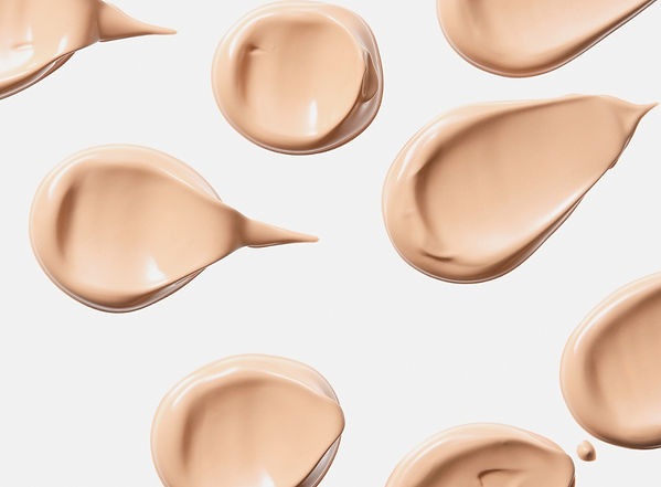
HIFU is an innovative Japanese skincare brand that combines advanced dermatological science with the refined rituals of Japanese beauty culture. The brand focuses on high-performance treatments that deliver visible results while honoring the artistry of self-care.
The Challenge
HIFU came to HelDesign with the goal of building a brand identity that could:
-
Reflect the innovation and precision of Japanese skincare.
-
Convey a sense of softness, elegance, and femininity without losing authority.
-
Stand out in the global skincare market while remaining rooted in Japanese aesthetics.
Our Approach
We set out to craft an identity that would balance clinical innovation with cultural elegance. Inspired by the delicate yet powerful nature of Japanese design, the visual system we developed emphasizes purity, softness, and modern sophistication.


Typography
We selected a lowercase serif font to give the brand a contemporary, approachable voice while retaining a sense of elegance and refinement. The gentle curves of the letterforms reflect the softness of skin, while the serif details provide a timeless quality.
Color Palette
-
Baby Pink: Representing softness, care, and approachability.
-
Amaranth Pink Gradient: A bold yet refined accent that symbolizes vitality, transformation, and radiance.
Together, this gradient system creates a sense of flow and transformation—mirroring the skincare journey HIFU promises to its clients.


The Outcome
The new brand identity for HIFU:
-
Establishes the brand as an innovator in the global skincare space.
-
Balances softness and authority, appealing to both a luxury and clinical audience.
-
Creates a distinctive and recognizable visual language through its unique serif typography and gradient color palette.
Since the rebrand, HIFU has strengthened its international presence, enhanced consumer trust, and established itself as a brand that embodies both Japanese heritage and cutting-edge skincare innovation.

Jetlogic – Elevating the Brand of Private Aviation
The Client
Jetlogic is a luxury private jet company that provides exclusive air travel experiences for discerning clients worldwide. With a focus on discretion, comfort, and efficiency, Jetlogic sought a brand identity that would reflect its premium positioning in the aviation sector.
The Challenge
Jetlogic approached HelDesign with a clear ambition:
-
Develop a brand identity that conveys exclusivity, speed, and precision.
-
Create a visual system that feels timeless yet contemporary in the competitive world of luxury travel.
-
Design a logo that embodies aviation while remaining minimal and elegant.
Our Approach
At HelDesign, we aimed to design an identity that captures the elegance of private aviation while making Jetlogic instantly recognizable in the luxury travel space. Our focus was on bold simplicity, ensuring every touchpoint communicated authority and refinement.


Logo Design
We crafted a circular logo icon featuring the letters J and L, abstracted into the form of aircraft wings. The design symbolizes motion, balance, and flight while maintaining a clean geometric elegance. The circle represents unity and continuity, reinforcing Jetlogic’s promise of seamless journeys.
Typography
A sans serif font was chosen to emphasize modernity, clarity, and precision. Its clean lines mirror the efficiency of private jet travel, while its bold weight conveys authority and trust.
Color Palette
-
Black: Timeless sophistication and authority.
-
White: Clarity, space, and purity.
-
Gold: A refined accent representing luxury, prestige, and excellence.
This combination allows Jetlogic’s brand to stand firmly in the world of luxury, where subtlety and exclusivity are more powerful than excess.


The Outcome
Jetlogic’s new identity:
-
Positions the brand as a leader in luxury private aviation.
-
Instills confidence and trust with a sleek, professional aesthetic.
-
Creates a memorable mark with its distinctive wing-shaped J+L icon.
Since its rebrand, Jetlogic has enhanced its international appeal, attracted high-net-worth clientele, and established a powerful visual presence in the exclusive aviation sector.
Ready to bring your brand to life?
Whether you’re starting from scratch or looking for a bold refresh, we’d love to hear your story.
Reach out to book a discovery call, ask a question, or just say hello.
No pressure — just great conversations and even better ideas.
Email us at: heldesigncontact@gmail.com
Follow us on Instagram: @hel.dsgn
Or fill out our form — we’ll get back to you soon.