Understanding Colour Theory:
The Secret Language of Design
Colour isn’t just decoration — it’s communication. In graphic design, branding, art, and even everyday life, colour tells a story long before words do. That’s where colour theory comes in — the framework designers use to understand how colours work together, how they affect emotion, and how they guide the eye.
Whether you're a seasoned designer or just colour-curious, here’s a breakdown of what colour theory is, why it matters, and how to use it with purpose.
What Is Colour Theory?
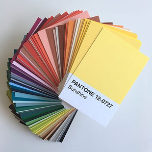
Colour theory is the science and art of using colour. It’s based on the colour wheel, a visual representation of hues arranged by their chromatic relationship. The wheel helps us understand how colours mix, match, and contrast — and it’s the foundation for countless design decisions.
The core concepts include:
-
Primary colours – Red, blue, yellow (can’t be made by mixing others)
-
Secondary colours – Green, orange, purple (made by mixing primaries)
-
Tertiary colours – Created by mixing a primary with a secondary (like teal or magenta)
Colour theory is more than a tool — it’s a visual language. Once you understand how colours relate, influence, and support each other, you start to design with greater clarity and confidence. Whether you're building a brand, designing a poster, or refreshing your website, the right use of colour can be the difference between “meh” and memorable.
So next time you’re choosing a palette, don’t just go with what looks nice. Ask what the colours are saying — and make sure it’s something worth hearing.